Build 1 Survey Data & Build 2 Upgrades

Hi folks, BowserPuma here!
First off, I just want to thank y'all who were a part of our launch weekend for Build 2! We have over 1,200 downloads so far and counting!
For this devlog, I want to address two things.
- Take a look at the upgrades we made for Build 2.
- Explore some of the changes we made based on survey data.
First of all, thank you to everyone who submitted survey data for Build 1! We had 211 responses, and it helps guide our team towards creating a better experience for you all.
Let's start off with the UI.
- We were able to provide a good amount of upgrades that improved the user experience.
- The old text box we used for Build 1 was a great start, but it had a few issues.
- The name box was designed as an integral part of the text box.
- That meant it wouldn't disappear when the narrator was speaking, nor would it dynamically change sizes based on the character's name length.
- For Build 2, we took a new approach and designed the name box and text box separately.
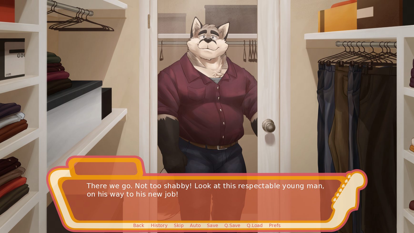
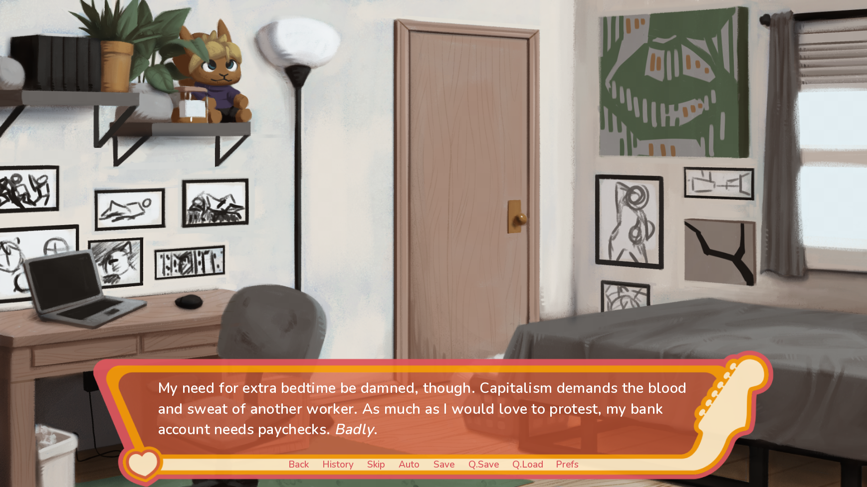
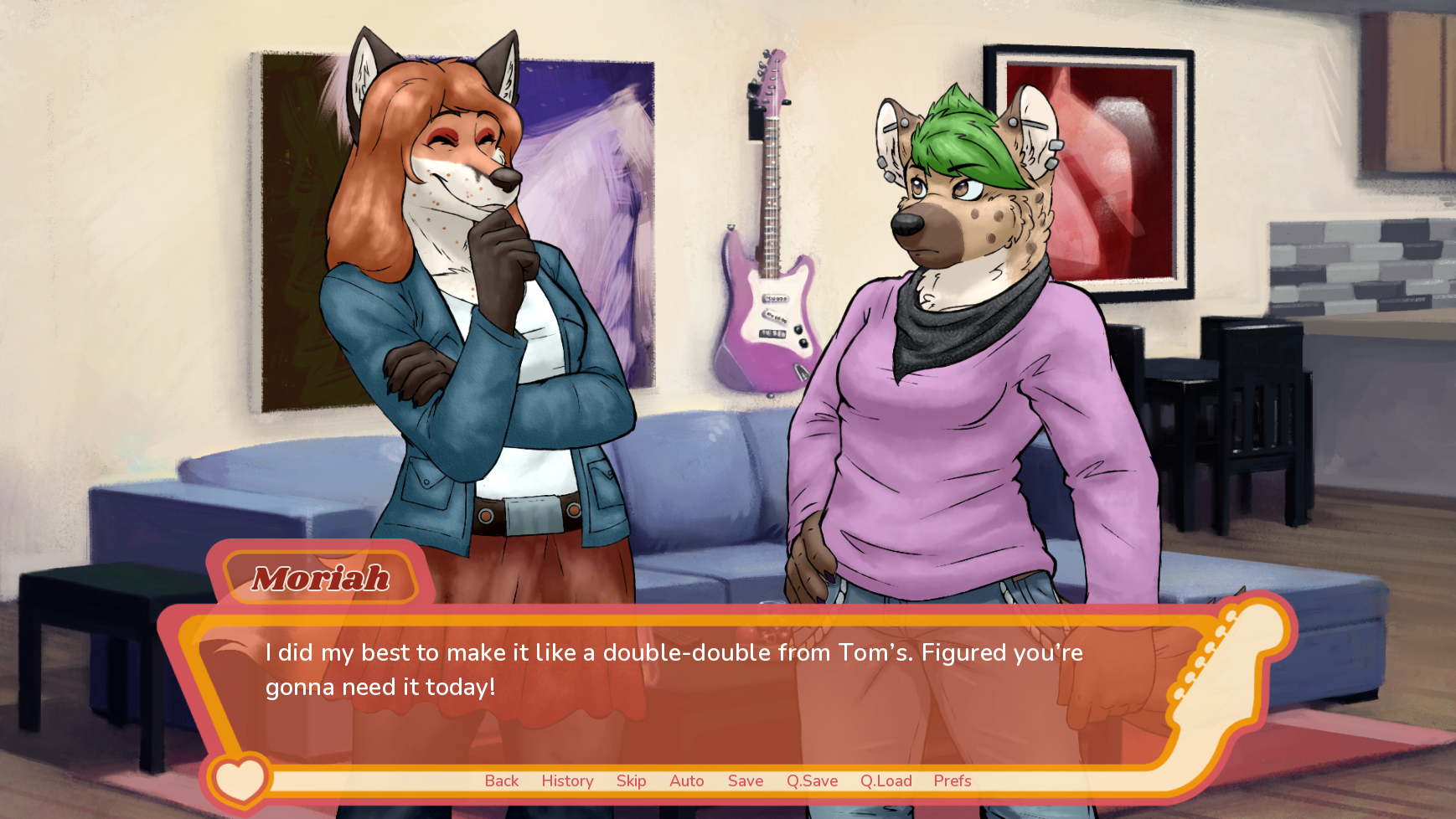
Some other small changes we made the UI include:
- New font! Using Nunito instead of the default Déjà Vu Sans.
- It's a small change, but Nunito is so much more pleasant to look at.
- New sliders for volume, text speed, etc.
- Small adjustments here and there to existing UI.
- Side note, I know on Android it still looks bad. Unfortunately, the UI assets don't translate very well from desktop to mobile. So, we're working on a new text box for Android.
Let's talk about the voice acting.
- The reaction to Build 1's voice acting implementation was mixed. Now that we're done collecting survey data for Build 1. Here's the data we've gathered:


- I'm not really looking to dissect all this info.
- I'm not an expert in survey composition and data collection, so I can only look at the general trends and have them guide my decision making process.
- All in all, it seems that a lot of people enjoyed voice acting on a conceptual level, but the execution wasn't the best.
- In all honesty, that's fair! Partial voice acting in a furry VN is something that hasn't been established in our niche yet.
- There aren't any templates or success stories for me to reference, so I have take some shots in the dark. I didn't expect to get it right the first time, so all I can do is just hope for the best and make changes as we get more community feedback.
- The formula for Build 1 voice acting was:
- The first line a character speaks.
- Any lines that are exemplary of a character's personality.
- The last line a character speaks.
- It was a good start, but here's how the formula changed for Build 2:
- First line a character speaks.
- The first line spoken during a scene change.
- Impactful or exceptional lines.
- Feedback so far indicates folks are enjoying the new formula. In particular, voice acting the "scene openers" works well, since it conditions the reader to expect to hear a voiced line.
- Also, some lines have been retroactively changed for Days 1, 2, & 3 to be congruent with our new formula.
To wrap up the discussion on voice acting...
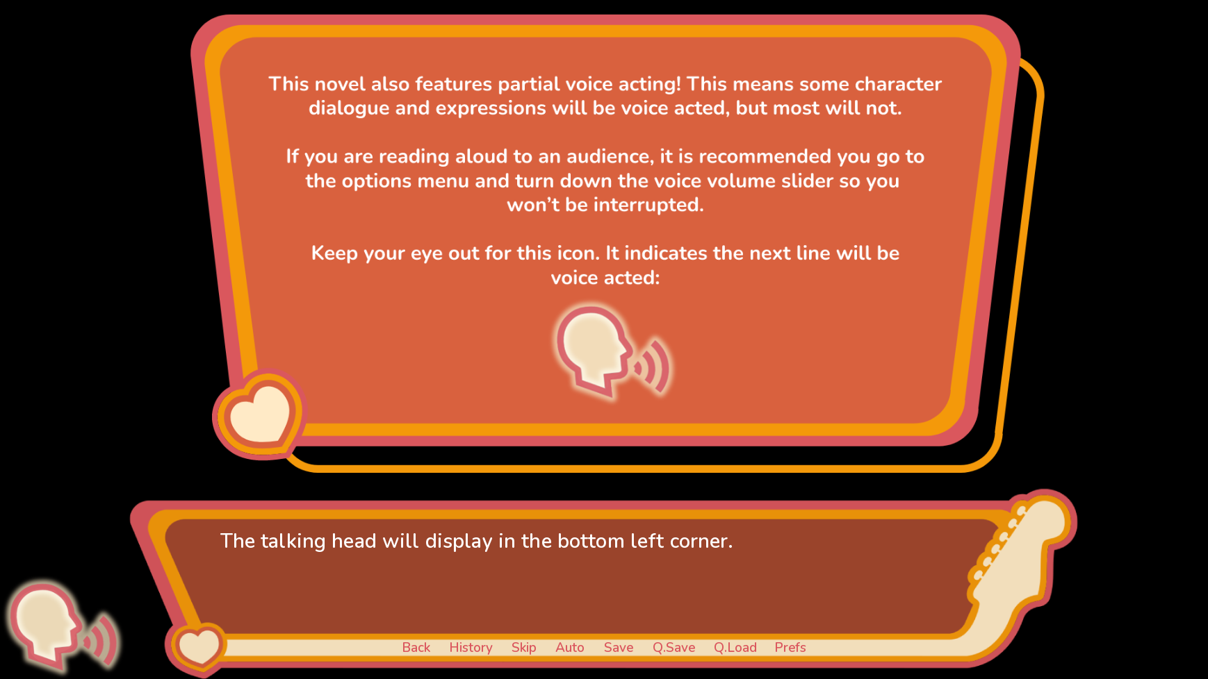
- Conditioning readers to expect voice lines was goal of a new feature we implemented.
- The little talking head in the corner was added to prepare readers for when voice lines are approaching so they feel less jarring and won't spook the player.

Moving on from that, we added some new tunes and sound effects!
- All in all, the majority of players seem pleased with our sound design based on survey data.
- This leads us to believe that our approach is solid! So we'll keep doing what we're doing.

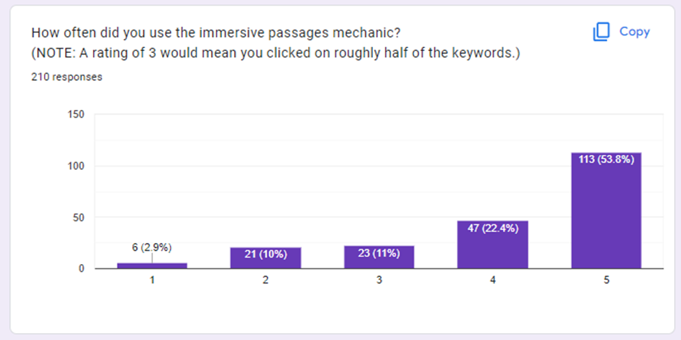
It seems like the immersive passages mechanic is getting used quite a bit!
- I'm really pleased with the success of this mechanic.
- My writing style lends itself to being overly descriptive, so it's nice to balance that out for folks who aren't interested in those nitty gritty details.
- Folks also enjoyed the little jokey-joke links that I sprinkled in there for the shits and giggles.
- Based on some feedback, I decided to change the colors of the links that open browser tabs. Some readers were understandably not pleased when a browser link opened unexpectedly.
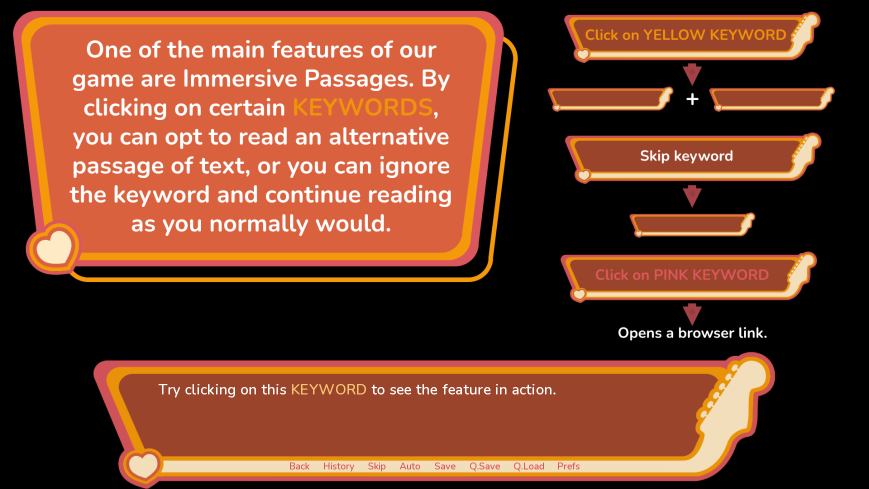
As evidenced by that last screen shot, we also made some changes to the preamble.
- I wanted to condense the information as much as possible, since the lengthy disclaimers seemed to turn off some readers.
- Using the graphics helps tremendously. We were able to cut our preamble down to 8 slides (at least)!
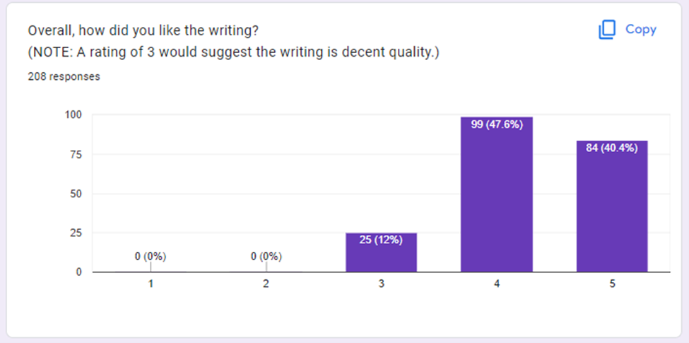
Lastly, let's talk about the writing.
- Most of you think my writing is better than decent, which is very flattering. Thank you!
- This is my first creative writing project since high school. I don't have a lot of experience, but I'm learning as I'm going!
- I'd like to think Day 4 is written better than all the other days. Hopefully that trend continues!
That about wraps everything up. One important note, I didn't include every survey question in this devlog. I'll be referencing some of the other survey data points in future devlogs. Namely, I'll be discussing data on love interests in another post.
Once again, thanks to all the fans who made Build 2 launch week a success. Much love to you all! 😸💖
Get Chord Progressions
Chord Progressions
Gay slice-of-life furry VN
| Status | In development |
| Author | Bowser Puma |
| Genre | Visual Novel |
| Tags | Adult, Bara, Boys' Love, Furry, Gay, LGBT, NSFW, Queer, Romance, Yaoi |
| Languages | English |
| Accessibility | Subtitles |
More posts
- Holiday Fan Art Challenge + Updates!16 days ago
- October 2025 Updates72 days ago
- Comments Temporarily Disabled76 days ago
- End of Summer 2025 Updates!Aug 21, 2025
- Staccato 7, Up on Patreon!Aug 11, 2025
- Chord Progressions is RE-listed! (+ Updates)Aug 01, 2025
- ChoPro... Legato??? (+ Updates!)Jul 27, 2025
- Itch has unlisted Chord ProgressionsJul 24, 2025
- End of Pride 2025 Updates!Jun 30, 2025
- Build 7 ErrataJun 16, 2025
Comments
Log in with itch.io to leave a comment.
Love these behind-the-scenes posts! It's so interesting to see what kind of things go into the development process of making great VNs even better!
Glad you like it!